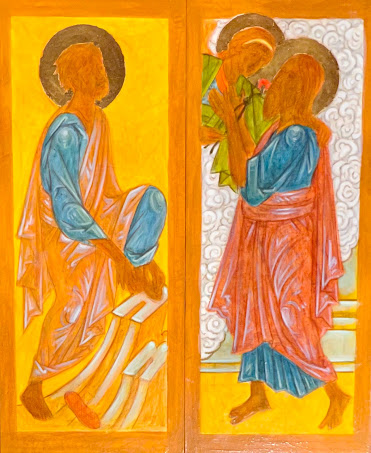
But in essence, this type of highlighting of the garment utilizes one color (usually, but not always a kind of bluish-gray to highlight a garment in a completely different color. In these panels, the garments are a kind of reddish brown (R) and a brownish/greenish ochre (L).
If (and its a big if in my case), the color is applied with just the right amount of transparency that builds up to the brightest highlight being barely but sufficiently opaque, and if the underlying color is transparent, well, it can be, as Pere Igor would say, terrific.
The key is restraint, combined with decisive and expressive brushstrokes. Getting it right takes a lot of practice - I still feel like a beginner every time, so I'm still practicing!

No comments:
Post a Comment